


Model Railroad Photography II - Basic Postprocessing
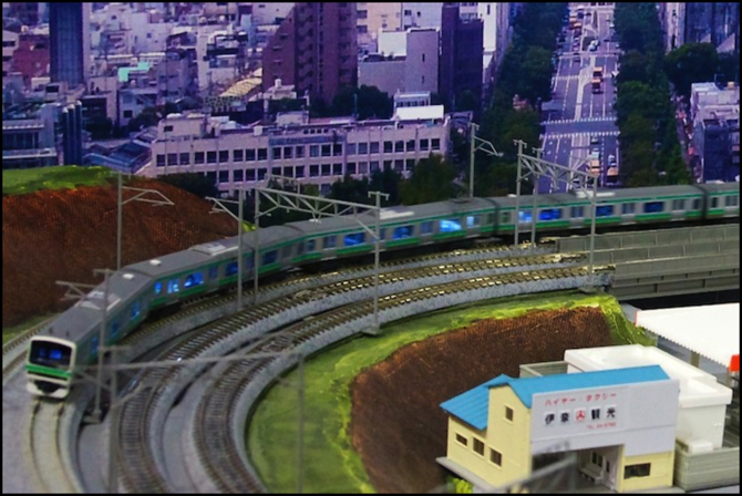
In the previous installment I wrote about actually taking the photograph. Today’s post is about what to do next. You can, of course, use the JPEG just as it comes from the camera. But in most instances, that won’t give you the best photograph. What I do varies from image to image, and most require very little work, but “very little” isn’t none. The image above is the final version; I’ll go through the steps to create it below.
Note: larger copies of these images can be found in the Image Processing photo album.
Image Size and Format
First is the question of what to start with. Most cameras will let you select several different sizes of image when taking a photograph, but even if you end up making it smaller later, and you likely will, I recommend using the largest size. Disk space shouldn’t be a limitation these days, and with more to start with, you can select what to remove.
If your camera will let you capture RAW data from the sensor, I recommend using that. It will require a bit of extra work, but it gives you many more options. There’s no single “raw” format, rather there’s one for each type or manufacturer of camera, since the content depends on the sensor in the camera and how the camera’s software collects data from it. Depending on the raw format used, you may need to use special software to process it (at least to the point you can export an uncompressed TIFF or compressed JPEG), although many formats are supported by commercial software such as Apple’s Aperture or Adobe’s Lightroom, see the “RAW” link above for some details.
If you don’t use RAW, you’ll likely have a JPEG image (file names ending in .jpg or .jpeg). If you use film and scan it, you will likely have a TIFF file (filenames ending in .tif or .tiff). TIF and RAW are both “uncompressed” formats, meaning no redundant data has been discarded and file sizes are much larger than a JPEG. Compression isn’t necessarily bad, but doing it more than once will tend to lose information (which limits the quality of the image). It’s best to work in an uncompressed format until done, so if you start with a JPEG the first step may be to put it into TIFF or some other “internal” form used by software (such as Photoshop’s .psd form).
Just to be clear: I use RAW from my Canon DSLR, taking the images directly into Aperture (I don’t use Canon’s software) and do nearly all of my work there. I’ll sometimes export a .psd file to work with Photoshop (Photoshop Elements, actually), but that’s very rare. In the end, I’ll export to a lightly compressed (80% quality level) JPEG of the desired size in pixels (which for me is 1024 across the longest dimension, except for my photo albums, where the software has a native limit of 800 pixels so I use that). Those 1024 pixel images get further resized by my web page software, which is an undesirable extra step I haven’t figured out how to eliminate yet.
Another format issue is the “color space” used for the image, which defines what colors are possible. There are two main contenders: Adobe RGB and sRGB. A camera that produces JPEGs will use one of these (which may be selectable in a menu, or fixed). If you process RAW, you can make your own choice. However, unless your goal is large prints, for which Adobe RGB has some advantage, use the sRGB format, as this is the standard for computer-based images and the web.
Color and Exposure Adjustments
From this point on I’m going to be describing how I use Aperture, since that’s what I know and use. For the most part, you can do the same things with other software packages, although they may have different sliders or more or less automation, and the adjustments will sometimes have other names. I can’t help with that, but Apple’s documentation is online, so googling terms like “Apple aperture exposure adjustment” will turn up pages describing what these do, and you can then look to your documentation to find an equivalent.
My first step after importing an image is to ensure that the color is correct. For a RAW image, this means setting (or changing the suggested) white balance as described in the earlier post. For JPEGs, the white balance is fixed, and you can only adjust colors directly. Most likely here will be a need to remove the green tint from fluorescent lights. Photoshop Elements has some tools for color adjusting that can apply to JPEGs. I don’t use these myself, so I can’t offer much guidance, but here’s a brief explanation of what you can do.
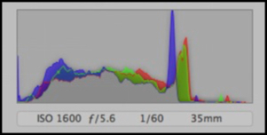
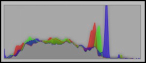
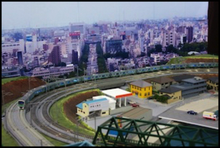
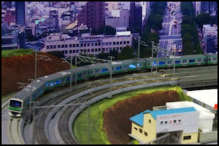
To make this explanation more concrete, I’ll use one of my old photos and show the steps. Here’s an initial copy of what I’d have if I simply took the RAW file and exported it as a JPEG. There are both exposure and color-tint problems here, due to the room lighting and the higher shutter speed I used (which caused me to use an ISO of 1600, which is really too high for good quality; I learned that lesson later). The histogram shows the distribution of pixels from dark on the left to bright on the right (taller peaks mean more pixels of a given intensity). The spike at far left shows that the image is too dark, and the lack of very many pixels in the right third show that it was underexposed (a histogram should be within the bounds, and typically closer to the right than left if it doesn’t fill the whole range).
One reason I used ISO 1600 here was because this was a photo of a moving train, and I wanted the faster shutter speed to freeze the train. This wasn’t a fast enough shutter speed to do this, so the train is slightly blurred, but that’s actually kind of interesting looking. I can’t claim it was intentional, however.
Note: it doesn’t matter if any peaks on the histogram touch the top, it’s only where there are peaks of any size at the far left or right that there’s a problem.
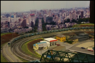
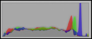
The Starting Point: unprocessed JPEG of the RAW file, with its histogram (WB 4057, tint 31)
If the image was under- or over-exposed, you can work on making it lighter or darker, or adjusting contrast. With RAW you have more options, and finer control (typically working with 12 or more bits per pixel of data, rather than the 8 of a JPEG). One very useful type of adjustment here is called “curves”, originally an Adobe feature this is now also found in Aperture (you need to “add adjustment” to add it to the set of ones you can use on an image) and other software. Adobe added “color curves” in PE8, so if you have an older version of PE, you’ll need to use a third-party plug-in (there are some, see this discussion).
First we’ll fix the white balance. This image has several neutral gray elements, so I can simply use the “eyedropper” tool and click on one of them. However, none is a true photographic gray, and depending on surrounding items the color can be shifted, so I had to try a couple before one that gave me a result that looked good. I could have then adjusted things further by hand if I’d wanted to, but that seemed unnecessary.
As noted above, if you aren’t using RAW there are still ways to deal with color problems, but they’re not as simple as changing the white balance.
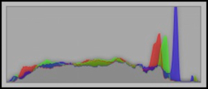
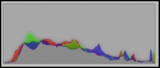
White balance set via eyedropper (WB 3509, tint 35)
Following that, the software has selected a white balance of 3509K and also changed the “tint” (Aperture’s method of addressing the magenta/green color cast that can be created by fluorescent lights) from 31 to 35 to remove the faint green cast. Note how the histogram shows that this processing made a number of blue pixels brighter, while differently reducing red and green. Also, the amount at the far left (which represent “crushed” blacks) has been reduced, but not eliminated.
The next step, now that color is right, is to deal with the exposure problem. There is more than one way to do this, and the specifics will vary with software. There are two parts to this. First, because JPEG uses 8 bits per pixel, but most camera’s capture more in RAW mode, you can actually recover from “crushed” blacks (pixels at the far left of the histogram) or “blown” whites (pixels at the far right). Again, the way to do this depends on the specific software. With Aperture, there is a “black point” slider for recovering blacks and a “recovery” slider for recovering whites. If you use both, you’ll remove some of the contrast in the image, and may want to play with the “contrast” slider (under the Enhance pane), which stretches the midrange contrast. Note: Exposure has an “auto” button, but I’ve found that all it does it make the image brighter, and usually not in a good way. I used it on many earlier images, but I don’t use it anymore.
Adjusted exposure (and black point, and contrast)
Here I’ve adjusted the “black point” slider to fix the crushed blacks, then used a light touch on the “exposure” slider to shift the whole histogram to the right, making the high end less sparse. This removed some of the contrast in the image, so I then used the “contrast” slider to put some of that back. That actually shifted some blacks far enough left that they were crushed again, so I added a touch more “black point” adjustment.
Noise Reduction
Now that the image is of the right brightness, I’m going to try to do something about the digital noise I introduced by using ISO 1600 at 1/60th of a second rather than ISO 800 and 1/30th (which would have been a better choice). Not all software allows for noise reduction, but it’s become fairly common. Aperture uses a fairly simple control for this, with just “radius” and “edge detail” sliders. The former adjusts how much noise is removed (too much tends to blur the image) and the latter avoids blurring edges (locations of high contrast). Neither is perfect, and as you can see in the samples below, some noise remains and the new image is more blurry. We’ll tackle that last problem later with “sharpening”.
Before Noise Removal - 100% crop from image

After Noise Removal
As you can see above, the change is very subtle (and probably not worth the effort). Look closely at the green stripe on the second car to see the effect (it’s also visible on the roof of the first car, but less so). I really don’t normally bother with noise reduction, and perhaps I could have done better if I were more familiar with it. And Apple’s version is fairly primitive, and there are probably other packages that can do a better job of removing it. I prefer to shoot at an ISO that doesn’t require noise reduction at all, but if you have to shoot in low light, it’s worth knowing that the possibility exists.
Curves
I have a couple of final tweaks to do, and I could have done these earlier. First I’m going to use curves to play a bit more with the overall contrast (this differs from my use of the contrast slider to adjust mid-tone contrast) by darkening blacks and lightening whites. You can do a lot more with Curves, but this image didn’t really need that. I’m also going to boost the “vibrance” slider by 5%. This last is because Canon’s RAW format tends to be a bit washed out for my taste (and for many other people) so making the colors “pop” a bit makes the image look better.

Curves-adjusted image
As you can see, this pushed the rightmost green peak close to the edge (it’s hard to see, look closely), so I’m now making full use of the dynamic range possible in a JPEG image. That’s not possible with every image, but it is ideal in terms on making the best of what’s available.
Re-Composing the Picture: Crop and Rotate
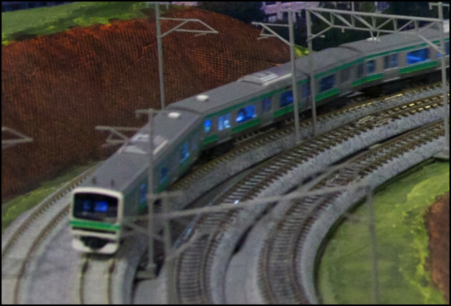
Now, two last steps remain. First, I’m going to crop out a section of the image to focus on the train itself. This will remove distractions and improve the composition of the picture. While I’m at it, I’ll rotate the image slightly to make the back part more level. It also gets a more “up close” look at the train, showing the lit windows and the motion blur.
Cropped image
So what happened to the histogram? It shows the distribution of pixel values in the image, and what this points out is that if I was going to crop the image, I should have done that early on, so I’d have been working on the pixels that mattered, and not all of the collected pixels. As it turns out, this wasn’t really a problem in this case: the green peak still isn’t crushed, but I tweaked the “recovery” slider just a hair to make sure it was fully in-bounds for the final image.
Sharpening
I also performed some sharpening on the final image. Aperture does this a bit differently from most other software packages, so my approach won’t necessarily extend to your use. The data from the camera sensor doesn’t do a great job of showing where the edges of things are, so cameras almost always perform a “sharpening” step before producing a JPEG. This is a global process on the whole image to increase the contrast between pixels that strongly contrast with their neighbors. These are (usually) edges, and thus this makes the image look sharper, and better, even though you are in fact making the image less accurate (in pure numeric terms).
Aperture, unlike most software, breaks this down into more than one step. First there’s a RAW Fine Tuning adjustment that’s preset based on the model of camera, and which does some global sharpening appropriate to the image sensor characteristics. This is less sharpening that you’d do with a global setting in other software. I never touch this (and in the latest version of Aperture, the preference pane is hidden, I believe, although I haven’t upgraded to that yet).
There are a couple of other adjustments that also do sharpening, but I haven’t used them here (and usually don’t). And finally, there’s an “Edge Sharpening” adjustment that tries to only sharpen edges, and that’s usually the final step in outputting an image (and the amount you do will likely differ depending on whether you’re aiming for print or online use). Too much sharpening can introduce noise or other junk, so this is another one to use with a light touch (I find Aperture’s default when you enable this too high, and back it off a bit).
Other Changes
Now I could have done a number of other things. For example, there is a catenary pole sticking in front of the train cab. With photoshop, this could be removed (essentially painted over using adjacent pixels) using a “healing brush”. Also, because the backdrop is a photo itself, the colors don’t quite match those of the scene. I could have masked this and performed selective color adjustments on the backdrop. Frankly, I think that’s all too much work for a run-of-the-mill model photograph. There are times I’ll break out that level of editing, but they’re rare.
And that’s it. Actually, that’s a bit more than I do for most images. Usually I just make sure the white balance and tint are right, and maybe brighten and/or crop the image to suit. I rarely need to play with black points or Curves, and never with noise reduction. And Edge Sharpening doesn’t really matter for images that will be shrunk down to about 1/3 the original size for the web (it can help a little, depending on the image; it didn’t do much for this one). But sometimes you need the full toolkit. That’s mine, at least for now. I keep finding new adjustments that can be used for specific problems. Keeping an open mind is the most important tool of them all.
Note: in discussing this, I’ve mentioned a number of Aperture adjustment panes that aren’t part of the default set. You need to add these (using Add Adjustment under the Photos menu) in order to use them.
Edit: Friday, 7/20/2012: added some missing subsection headings and fixed a couple of typos.