


Making Photo Backdrops
When I first put together the layout tables, I included a simple backdrop of 3/16” (5mm) hardboard mounted on pine supports bolted to the back of each table. These were 18” tall (45.7 cm) on the four main tables, and 24” (61 cm) tall on the end scene. All were primed then painted with a light blue interior latex as a base for eventual future work. Exactly what that future work would be wasn’t clear at that stage, although I had numerous ideas from other layouts I’d read about.
Since my model railroad depicts a contemporary urban scene, a simple painted backdrop of hills and trees wasn’t going to cut it, but the pre-printed ones I found were either rural or depicted mid-century American urban/industrial scenes. Tōkyō is about as contemporary as you can get, and the amount of signage present in the real one makes images of non-Japanese cities unconvincing. Not to mention the fact that Earthquake-prone Japan avoids the use of brick or stone in modern construction, something hard to avoid in pictures of U.S. or other cities.
So I decided to use enlarged photographs of Japanese cities to make my scenic backdrops. The only problem was that I’d have to make do with what I could find, as I’ve never been to Japan and a trip for purposes of photography wasn’t practical. But using existing photographs brings with it some problems to solve. Not particularly hard ones, but I’m going to write up my solution so I don’t forget what I did. And hopefully these notes can serve as a short-cut to others.
One thing I want to emphasize: when making enlargements of this size, the choice of original image to enlarge is critical. As you can see in my description of the enlargement of the River Crossing image, I was handicapped by a relatively low-quality image there, and ultimately the clarity of the backdrop was never going to be as good as on the two other scenes, where higher quality images were used as the starting point. You really need a large and crisply-detailed photograph taken with a Digital SLR using care to avoid blur.
One caveat: I’m not a graphic artist, and my photography skills are amateur at best. There may well be better ways to do things, and other tools that are superior. This worked for me, or at least it appears that it will; after a year the first backdrops are holding up well, so it looks like a success.
Image Editing Software & Practice
I used Photoshop Elements on a Mac (primarily versions 8 & 9; the latter is what these examples are drawn from) so that’s what I’m describing. Other versions may have the same or similar controls in other places, or even under other names. All work was done on a MacBook Pro with 4 GB of RAM, and as some of the images involved were several hundred megabytes when saved; lots of RAM and disk are a necessity for this kind of work.
I saved copies of my working files (the .psd files) under a different file name before each major change, and sometimes threw out the changed version after a bit of work and went back to the last saved copy and started over. Being able to experiment with no repercussions if you fail is important as there isn’t necessarily any one “right” answer when trying to make something “look right”, and you can’t know in advance what will work (well, not if you’re as unskilled at this as I am anyway).
Photo Selection & Copyright
I started with several photos I found on Flickr by searching there for terms like “tokyo” and “urban”. I used the Advanced Search to limit my searches to images with creative commons licensing that would select only “content to modify, adapt, or build upon” (i.e., a form of the CC license which allows derivative works) since I planned to show the results here. That might be an overly-strict interpretation of “derivative work”, but I prefer to err on the safe side. Additionally, most if not all non-licensed images on Flickr can’t be downloaded in full resolution, and you need that for a backdrop.
Most of what I found ended up with the “by-sa” license, which is often compared to open-source “copyleft” licenses, in that it allows even commercial use, with the original creator given a credit but not a share of the profit. It does however require the derivative work to be provided for free under the same license (or an equivalent). Given that, I could distribute my final images in any fashion I choose (even selling them), as long as I credit the original photographer and post my images online for free access.
That’s actually more than I need since I have no plans to distribute or sell my images. But it certainly means that posting thumbnails online is okay, as well as photographs of my layout with the modified images in them. In fact it could be read as requiring thumbnails of the modified images at least as large as my online photographs (e.g., 800 pixels square), although since I can’t see any way those would be useful, I haven’t gone to that length. If any copyright holder complains, I’ll put 800-pixel copies in one of my photo albums.
Even though my use is non-commercial and transformative, and unlikely to affect the commercial value of the original, I’m using nearly the entirety of the original work (the photo) to create a derivative work. Thus, this use fails one of the four tests for the U.S. Fair Use doctrine. That doesn’t mean it isn’t fair use, particularly if I’m only showing low-res images of the final result (which may cover the fourth test) and not posting the high-resolution image, but does make it harder to claim that. In addition, Fair Use is defined in the U.S. (U.S. Code, Title 17, Section 107 (PDF)) as applying to uses “such as criticism, comment, news reporting, teaching..., scholarship or research”. However, in practice it’s also been extended to certain forms of duplication of legitimately-acquired works for personal use (e.g., off-air taping of radio and television or ripping owned CDs into digital audio files). While my use here would likely qualify as teaching, and my use on the layout seems to fit the general outline of personal use, there are no hard and fast rules here to go by, which creates the potential for disagreement.
In short, there’s something of a gray area around the rights granted a creator by copyright law and digital objects. Once I have an object in what ways can I use it (e.g., as part of a hobby activity) and what uses would require obtaining permission from the creator? This is an area much in dispute today. Since photos of my layout include the backdrops and I want to document that online, and potentially in other venues in the future, potential limitations (or arguments about whether there were limitations) on publication of those were undesirable, so I stuck with images that had been licensed to allow non-commercial use of derivative works with attribution, as that is an explicit statement (a “license” in legal terms) by the creator that they allow such use. That means the images needed to bear the CC by, by-sa, by-nc, or by-nc-sa licenses or equivalent (one of the GPL licenses used in older Wikimedia images, for example).
As noted above, there’s another reason to seek out CC-licensed images: on Flickr, most non-licensed images don’t allow downloads of the full-size version. They’re there as advertising for the photographer’s business licensing them or selling prints. Without a full-size image (and one from a camera with sufficient megapixels at that), you don’t have enough image to work with to make a backdrop.
Note: my Backdrop Photos page has links to the originals of the photos used here, along with attribution of their photographers and other details. It also contains links to other sources of suitable backdrop photos, although many of those aren’t formally licensed via Creative Commons or similar licenses.
Composition and Perspective
Typically what you want in a photograph is something to draw the eye, often called a “focal point” of the image (different in meaning from the use of that term in optics). And pictures taken at an angle may appear more interesting, as their difference from reality is emphasized. Both of these are very undesirable in a backdrop. First, the backdrop is ancillary to the model railroad layout, and the “focal point” of a scene should be on the layout itself. And second the backdrop needs to sit behind scenery that is level (or sloped in a naturalistic way) and fit in with that. In short, you want a fairly boring image that’s level, without distorted perspective from being taken at an angle. If you can’t quite find the right image with all of those features, there are things you can do to correct for some of them, but that’s the ideal.
Also, you can have a focal point if it’s not dominant. My River Crossing scene backdrop uses a photo with a central avenue, which tends to draw the eye as an extension of the avenue on the layout. Model railroad backdrops often use roads in this manner. Part of the reason for this is that it creates a greater sense of depth by linking the foreground to the backdrop. The downside is that it’s pretty obvious that the backdrop is a photo, and this is calling attention to it, helping to break the illusion that the model continues into the backdrop. This is a technique that has to be used in moderation and with care.
Another thing to be aware of is the viewpoint of the viewer as opposed to the camera. If you take a photo of a cityscape, when looking through the viewfinder the image on your retina will be the same 2D representation of the original captured by the image sensor (or film) in the camera. But once you blow it up and glue it to the backdrop, the image can’t change when the viewer moves. The further the viewer’s eyes get from the imaginary location of the camera relative to the backdrop, the more distorted the image will appear to be (compared to what you’d expect from such a viewpoint). Strong vertical lines are the worst for this, and thus something to avoid for off-axis viewing. Since that’s rather hard to avoid with a picture of a city full of tall buildings, you either need to design the layout to avoid off-axis viewing, model rural scenes, or live with the distortion.
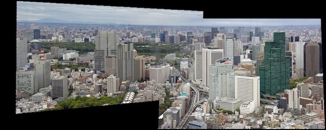
Take the following three images. The middle one is the original photo, while the other two are photos of the layout viewed from the left and right sides (the usual viewing positions for this end scene). In all three, the tree-lined central avenue is vertical (the photo never changes), but because of the viewer’s perspective it appears to angle away from the viewer relative to the layout scenery.
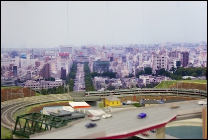
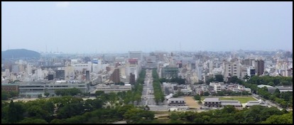
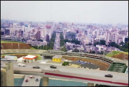
Another thing that is apparent from this is that the photo was taken from a high elevation. In this case, Himeji castle, on a hill overlooking the city of the same name; others I have used appear to have been taken from a skyscraper in Tōkyō. That’s typical of extensive cityscapes, as otherwise you’d only see the front rank of buildings. I think these work, as the typical viewpoint of the observer is several hundred scale feet above track level. But they’d be problematic for track-level photographs of models (that perspective problem again), or if your preferred viewing position is close to the ground. In which cases, you’d need to seek out photos taken from lower angles (perhaps from a park, where there aren’t any close foreground obstacles).
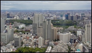
Note: there’s an obvious color-cast in the layout backdrop images above. Part of that is real, in that the image is being viewed under roughly 4,000°K light, whereas photographs are typically color-balanced for 5,000°K viewing, which tends to make the layout images look “redder” than they are. But a lot of it is due to this being my “1.0” approach to backdrops, which put the image on non-photographic “presentation” paper. As you can see in the “2.0” cityscape at the bottom of this page, the colors look much better when photographic paper is used.
Finally, consider the transition from layout to backdrop. You probably want to hide the edge behind something slightly in front of the photo (like a fence an inch from the backdrop, or a hillside or row of buildings). And the buildings on the lower edge of the photo need to look “right” in terms of size. If they’re supposed to be right up against the edge of the layout, they need to be about the same size as a scale model. If they’re further away they need to be smaller. Some test prints cropped out of the main image and printed on an ink-jet printer on 4x6 or 8x10 paper to check size would be a really good idea. I didn’t do a particularly good job of this; except in one instance, my test prints weren’t the same size as the final print and I didn’t think to check building size until later anyway.
Size (Resolution) Matters
Typical 35mm negatives had a horizontal resolution of around 3,000 - 4,000 film grains, roughly equivalent to pixels on a digital image. Actual photograph resolution wasn’t necessarily that good, and depended on lens quality more than anything. If taken with a good film (ISO 125 or so) these could be blown up to 8 x 10 size without losing detail (i.e., a bit more than 300 dpi). A good digital camera with an 8 megapixel (MP) image sensor is probably going to produce similar results. As noted other factors than mere size may dominate, but you won’t get the same results with a 4 MP cellphone camera with a crappy plastic lens. Assuming you used a decent camera, 300 dpi is a good measure for a “very high quality” image.
Now a backdrop image doesn’t need to be as good as a photograph you’d frame and put on a wall or desk. But it does need to have enough detail that it won’t seem blurry from a typical (3 - 4 foot) viewing distance. The rule of thumb for enlarging photographs is that standard photo viewing distance is two feet, and for each doubling of that you can halve the pixel-per-inch requirements from the initial 300 dpi. This is based on the “minimum” viewer distance.
For 3-4 feet that means you need a bit more than 150 dpi for true photo quality, and the full 300 dpi if some viewers might be right up against the fascia 2’ from the backdrop. But I’m also using the image for background, where the viewer won’t normally be looking directly at it. My initial target was 150 dpi, although I changed this later for the River Crossing scene. That’s only approximate, and I have used slightly less with moderate success. As we’ll see in a bit the first problem to deal with is that most photographs, even the good ones, aren’t large enough, but you definitely want to start with more, not less, and without blurring in the source image.
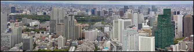
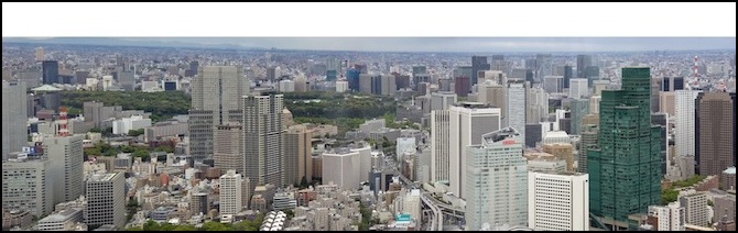
So once you’ve found a candidate image, you need to know how big it is (i.e., what its dimensions are in pixels). In Flickr, right-clicking (control-clicking on a Mac) an image will allow you to see the “original”, which has the largest pixel count. That’s the one you’ll want to download, and at the same time make note of the number of pixels on the long axis (presumably you found a horizontal picture). The above panorama has 3,072 pixels the long way (and 1,288 vertically). Attached to a 48” backdrop, that’s 64 dpi (3,072/48), which is pretty far below 300 dpi. But doubling it is relatively easy, and we’ll come to that below.
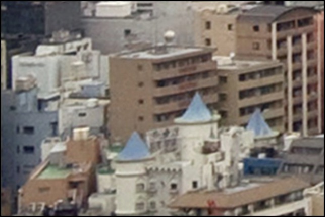
Note: in hindsight, even doubled the resolution wasn’t quite good enough with this photo. It was usable, but I ended up looking at it too closely and seeing the fuzzyness. However, this may be due to the photographic (i.e., lens) resolution of the image, as this was taken with a 4 MP point-and-shoot camera (you can tell by looking at the EXIF tag metadata for the original photo), while other images that doubled to 140 dpi but which had been taken with an 8 MP DSLR looked much better.
I thought at first that it was made by stitching several photos from a 4 MP point-and-shoot camera (with a decent lens) together, but the metadata on the photo indicates that it was made by a 7 MP Panasonic point-and-shoot with a wide-angle lens. And that’s another issue to consider. The small lens of the point-and-shoot is probably the reason image quality is a bit poor compared to a photo taken using an SLR. But the basic rule of thumb I use is that for a 48” wide print, the source image needs to have at least about 3,600 horizontal pixels, which would equate to a 9 MP camera. I can live with a bit less, but this image (3,072 pixels wide) I used on the River Crossing scene is pretty much at the minimum, particularly given that it wasn’t taken with an SLR. And ideally, you’d want to start with more pixels if you could.
Download the photos you want to use and save the originals, without doing any modifications to them. If you’re working with your own photos, you could start from a format such as RAW or uncompressed TIFF to avoid losing any detail at this stage. But there’s no point in saving an online JPEG as a TIFF; the detail you might save is already gone. Ideally you should save exactly the file that’s downloaded, without going through any software that converts it to an internal format. Once you start editing it you’ll be using an uncompressed internal format copy made from the original, and JPEGs won’t be used for intermediate images, you’ll only go back to JPEG for the final image.
Note: With JPEG, if presented with a “quality” setting, I use 8 (high but somewhat compressed) on a 10-point scale (80 on a 100-point scale). This is not perfect, and may lose some detail, but very little if only done once, and I assume the original probably wasn’t saved at any higher quality, so benefits from less compression are minor at this point.
You should probably get other changes made (e.g., straightening and cropping images) before enlarging them as it will be easier to work with the smaller images. However, the end result may be better if you enlarge them first (this assumes you aren’t merging images that need to be resized to match). Until you are ready to enlarge them, you should disable any “sharpening” done by the software. See my Enlarging Photos page for more on this topic.
Making a Panorama: Starting Images
If you can’t find a panoramic photo that meets your needs, you may be able to find several overlapping photographs someone took from the same position, which can be used to make one. One benefit is that you’ll get more horizontal pixels this way. I turned up a number of these in my searches. Creating a panorama from overlapping photographs is nearly a no-brainer today, although there are a few things to be aware of.
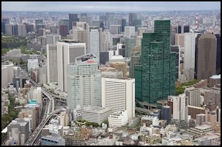
As an example, I’ll use the two photos I used for my Urban Station scene backdrop. They were taken but the same photographer, using the same camera, but that doesn’t make them identical in other regards, just “similar”. These are somewhat flawed by a high viewpoint, but worse they don’t match in size or perspective. Even the exposure seems subtly different, with the left one being darker. The right one also shows more of the foreground, but we’ll cut that out (and the excess sky on the left) as part of making a panorama.
Left (3463x1974) and Right (3450x2268) source images
Once these are downloaded, you can load them into Photoshop Elements (which I’ll abbreviate as PE from here out) and check out the metadata using “File / File Info”. Aside from the camera model (in this case, a “prosumer” Canon SLR) and pixel dimensions, the interesting ones are the lens type (17-85mm zoom with max aperture of f/5.6, which is a typical entry-level SLR lens), Focal Length (50mm is mildly telephoto on this camera, which should minimize distortion), and the aperture of f/8 (moderate depth of field; high numbers are better) and speed (1/500 sec: anything over 1/125 is going to eliminate blur from vibration, but 1/500 will make even fast-moving cars sharp; I’d have been happier with a slightly slower shutter speed and larger aperture value to give more depth of field, say f/11 at 1/250 or even f/16 at 1/125 since there’s nothing moving close up) because more depth of field keeps both foreground and background elements in focus, which is important for creating the illusion of real scenery. The ISO value also matters, as higher ISOs tend to have more digital noise. This depends a lot on the specific camera; for the EOS 20D, ISO 400 was about the largest you could use before problems became visible, later models worked equivalently at 800 (I own an EOS 40D, and I can’t tell the difference between 400 and 800, but 1600 is visibly more noisy).
The use of an SLR, as well as the high shutter speed and moderate aperture and ISO settings, are all indications of a suitable photo. Of course, you could probably tell that just by looking at the images closely. More importantly, both were taken at similar focal lengths (50mm and 47mm) and apertures (f/8) using the same lens. This minimizes any differences between the two images. And since everything in the photo is far enough away that the camera is focused on “infinity”, the moderate depth of field isn’t a significant problem.
The reason Focal Length matters is related to distortion. A “normal lens” is one with approximately the same field of view as the human eye. Lenses that show a wider view are called “wide angle” lenses, while those that show a narrower view make distant objects appear closer, and are called “telephoto” lenses. And focal length in conjunction with the sensor (or film) size determines the angle of view. In 35mm film cameras, 50mm was the lens size that best represented what they eye would see. This matters not so much for the angle of view, but because significant differences from “normal” can introduce distortion into the image. This depends on other factors as well, but a significantly different focal length is an indicator to look closely for problems. If the “Lens” tag is given as a range, the lens is a zoom lens and the focal length shows what it was set at.
Few people use 35mm film cameras anymore, and while high-end Digital SLRs work the same, most consumer DSLRs (and all point-and-shoot cameras) use smaller sensors, and these have shorter “normal” focal lengths. For a typical consumer DSLR around 30mm is normal. Point and shoot cameras may have even smaller “normal” sizes. Unfortunately figuring out what a camera’s “normal” is, is not easy. Some cameras will record a “Focal Length in 35mm Film” tag in their EXIF metadata, and you can use that as a guide. Here’s a 35mm focal length calculator that will let you convert focal lengths for some typical cameras to the 35mm equivalent. You can also google for the cameras “crop factor” (multiply the real focal length times the crop factor to get 35mm equivalent focal length). Most consumer DSLRs have crop factors around 1.6. Thus a 30mm focal length in a consumer DSLR equates to 48mm in a 35mm camera, and such a lens would be “normal”.
A wide-angle lens (and also zoom lenses set near the low end of their range) can distort the edges of a photo, causing straight vertical lines (like building sides) to curve or lean to one side. If the focal length and lens tags suggest the photo was taken with such a lens, look carefully at the photo to see if buildings near the edges aren’t really vertical (PE has a “grid” you can turn on that helps with this).
Telephoto lenses introduce their own forms of distortion, however what a telephoto lens does is distort depth of field, making distant objects look closer than they are and thus compressing the overall depth of a scene. This is fairly subtle, except with very long (i.e., high focal length) telephoto lenses. On a 35mm camera, lengths much greater than 100mm are an indicator of a possible depth issue. With smaller sensors, lengths greater than 80mm or even 50mm may indicate problems. Also, some point-and-shoot cameras take telephoto shots by using only a portion of the sensor, thus an 8 MP sensor may act like a 4MP or even 2MP sensor, lowering the quality of the image. If the lens appears to be a telephoto or zoom at the high end of its range, look for lack of depth of fuzziness in the image.
For the terminally curious, here’s a discussion of how focal length relates to the size of the image sensor in a digital camera.
In this image, having a focal length around 50mm is good. Since the EOS 20D uses a small size DSLR CCD, 50mm on it is really equivalent to 80mm on an old film 35mm SLR, which makes it a mild telephoto size, but that’s still acceptable.
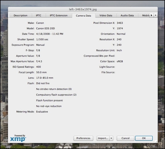
Metadata: 400 ISO, Canon EOS 20D (SLR), f/8 on a f/5.6 17-85mm zoom lens, 1/500 sec shutter
Matching Images
It’s a good idea to start with the two images as close as possible in exposure and color balance. To start, I load both into PE and save them as .psd files (“File / Save As” Photoshop), so I don’t lose any detail through additional JPEG conversions while I’m working on them. This bulks them up (from ~2 MB each to ~20 MB each).
Now you could do a lot of fancy work at this point to adjust the photos, tweaking luminosity curves and similar arcana, and if that’s your thing, go for it. I’m lazy. I click the “Auto” button on PE’s “smart fix” pane for each image to let PE try to make them look good (and hopefully similar). Since they started out fairly close and of good quality, this seemed to work well. If it hadn’t, I might have experimented with other settings to try to get them to look similar (mainly I’d be concerned with exposure, although if they’d been taken at different times, color-balancing to correct for differences in light might also be required).
Photoshop has some ability to make one photo “match” another. I didn’t try to use that here, as again it didn’t seem necessary and that’s a tool I don’t have any experience in using.
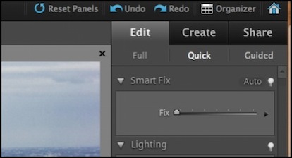
PE “Smart Fix”
The “fixed” images (both lighter, but the left moreso)
Merging Images
Now to make the two images into a single panorama. Save and close both .psd files, then select “New / Photomerge” and select the source files. Make sure “Blend Images Together” is selected. And for Layout you could choose “Auto”, but I prefer to use “Interactive Layout”. Once you click “Ok” the program will take a long time to process both images, and it may seem like nothing is happening, but wait and it will eventually open a white window with the two images overlapped in the middle.
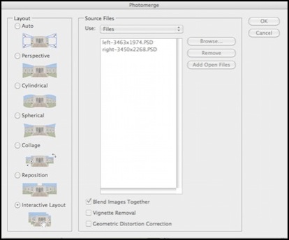
Merging the source files
Overlapped images (note horizon mismatch at end of diagonal)
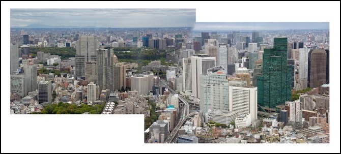
As you can see, this first attempt isn’t too good. The horizon in the center is rather obviously wrong. I used the zoom tool (magnifying glass) and clicked a couple of times where the two images overlapped to get as much magnification as I could. Then I used the arrow tool to slide one of the images around until I had the horizon level (or as close to it as I could get).
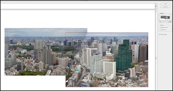
Repositioned Image
Merged images before fill (note horizon just left of dialog box)
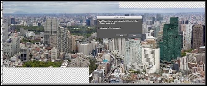
After clicking “Ok” it merges the two (fixing the difference in exposures while it’s at it) and then PE9 offers the option to “fill in the edges” (I don’t recall PE8 doing this). I took that (and as you can see below it did a much better job at filling in sky on the top-right than buildings on the lower-left; however sometimes this didn’t work, and I ended up with buildings in the sky; in the end I didn’t use this). For some reason the left side of the horizon is now wrong.
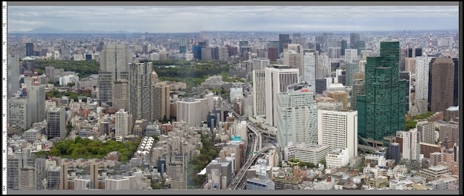
Finished merge with filled buildings (lower left) and sky (top right); horizon still wrong
So I trashed that version and went back and tried again. The problem is that while the image can look right on the screen before the merge, the two photos don’t exactly line up (the camera wasn’t held quite level between them), so when PE tries to line all the pixels up, it fails. The solution is to click the “Perspective” button rather than the “Reposition Only” one.
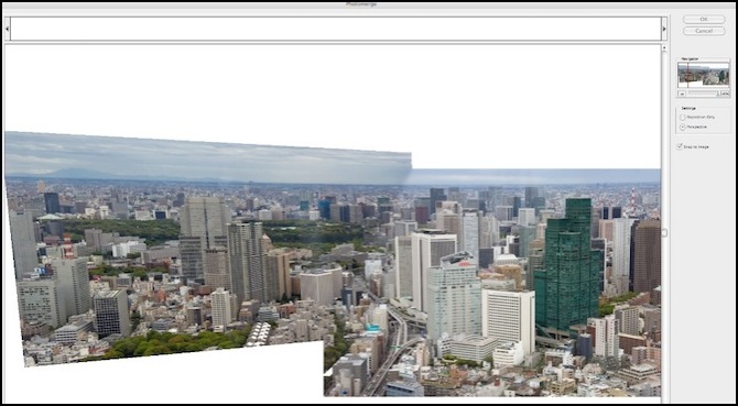
The “corrected” perspective
Saved version (note the exposure matches better than in the preview)
As you can see, there’s a bit of a skew in the left photo relative to the right now, and the buildings are no longer vertical. That’s why I was trying to make it work without clicking “Perspective”. But we can fix this. First, turn the “grid” on (“View / Grid”). Then select “Image / Transform / Skew” and pull the top left and top right handles (the little squares) towards the middle until the vertical sides of the buildings mostly line up with the grid lines (perfection is likely impossible here). Once satisfied, click the green checkmark to make the changes and save the result in a new .psd file (just in case you want to go back to the pre-skew version and re-do this step later).
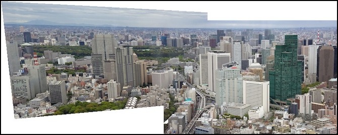
Panorama after “skew” transform
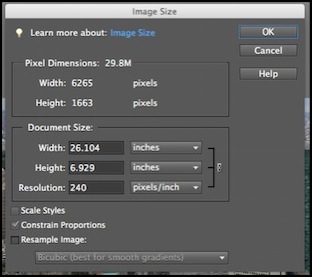
Now, using the selection tool (dashed rectangle on the left margin; should already be selected) outline as much of the image as you can without going outside the picture itself. This will cut off the edges and give you an even rectangle. Then select “Edit / Copy Merged” and “File / New / Image from Clipboard”. This creates a new image of 26” x 7” (6265 x 1663 pixels).
Clipped image
Resizing
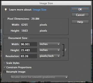
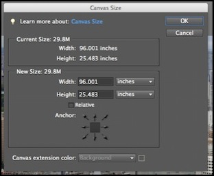
At 6,265 pixels, this is insufficient for a 96” panorama (65 dpi). It’s also presently saying it’s 26” wide, and while that’s mostly just informative, it can potentially confuse things later when you go to print it. So we’re going to first change this to be 96”, then we’ll come back and add pixels.
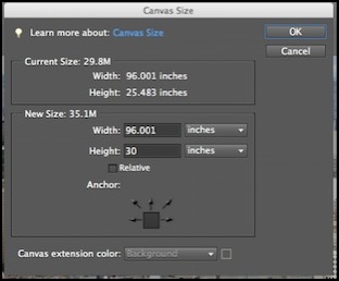
So first, select “Image / Resize / Image Size”, make sure “Resample Image” is NOT selected and type “96” into the width field (note that height changes at the same time since “Constrain Proportions” is selected). However, the height is now 26”, and my backdrops are close to 30” high. I could stick with that, and add some sky (or have the top of the image slightly below the height of the backdrop). But this is a hard image to add sky to due to the mountains on the left side and the curved horizon (a side effect of fixing the building perspective). So instead I’ll make the height 30”, which makes the width 113” (meaning I’ll have to discard some of it, or perhaps use it on the viewblock at the left end of the scene).
Before (left) and after (right) resizing the image without changing the pixel count
If I were going to add sky, what I’d do now is go into “Image / Resize / Canvas Size” using the 96x25 image and click the down arrow (to cause the addition to be at the top) and set the height to 30.
Before and after canvas size change
Resized canvas without sky (note white fill in new section)
But adding a sky isn’t required, so I’m going to go back to the 113x30 image and instead work on that.
Adding Pixels
This section is about using Photoshop Elements (PE) to do the enlargement. I’ve since decided that specialized software does a better job. PE will work okay for modest enlargement of a good image, but often more than “modest” is required for something as large as a backdrop, and specialized tools will do more to improve the result. They don’t improve it a lot however, and there’s a significant cost. If you only buy one tool, buy PE as it’s more useful for other things. But if you want the absolute best enlargement you can get, for greater than about 4x enlargement, buy a specialized enlargement program as well.
Later, for the River Crossing scene, I did just that, in part because I needed more than 2x enlargement. For details of that work, see the Enlarging Photos page.
Adding pixels has limits because you can’t really add information that wasn’t there before. What the software really does is guess at likely values for the color of new pixels based on the surrounding pixels. This works reasonably well for doubling the number of pixels in a given dimension (i.e., doubling the dpi) given that I’m not trying for close-up viewing. I do this in a single step (adding 100% to the original pixel dimensions), but I’ve read that the Photoshop technique works better if you add just 5% (or even 1%) at a time and repeat the procedure many times.
For the two main scenes, I could get by with 2x, so I first used PE with “bicubic resampling”. To use that, take the 113x30 image, and open “Image / Resize / Image Size” again, but this time check “Resample Image”, which makes the two top fields editable and “Bicubic Smoother (best for enlargement)” in the pull-down. Take the resolution (55.433 in this case) and double it (110.866). Note that with this change the size remained the same, but the horizontal and vertical pixel count doubled (to 12,530 x 3,326).
Note: when using PE, use of sharpening is also important. I’d overlooked this initially, and later I didn’t do much with it since I’d switched to use of a separate enlargement program by then. In a nutshell, “Lens Blur” seemed to produced less noise, while “Gaussian Blur” might have had slightly better defined edges (it was close either way). For a 0.5m (19”) viewing distance and a 300dpi print, use a radius of 2.4 pixels. That’s also the number to use for 1.0m distance and 150 dpi.
Adding pixels by changing Resolution
You can view the image at “actual size” to see how it looks. Remember to stand several feet back from your monitor to replicate layout viewing distance.
Approximate actual size (416 x 625 pixel) selection from final image
Another thing I should have done at this point was test print a section of the full-size image that showed a foreground building (e.g., the white one in the center of the right half), and make sure it was smaller (in terms of height between floors or window size) than an N-scale building placed in front of it. If it isn’t, it’s going to look subtly wrong. I actually have this problem, although I didn’t discover it until the image was mounted (but I’d been suspicious from looking at the print). It’s close enough that I’m going to live with it, as there really isn’t any alternative other than finding a different photo to use.
One of the reasons I left this step until nearly the end is that it drastically increases file size (we’re up to 240 MB now).
Selecting and Saving
Now it’s time to divide the image into two 48” sections. I chose to work from the right side: 113 - 48 = 65, so I used the selection tool (dashed box) as before to select a rectangle from the 65” ruler mark to the right side, and from top to bottom, and did the “Edit / Copy” and “File / New / Image from Clipboard” steps again, then saved the new .psd file. Repeat for the left side from 17” (65 - 48) to 65”. Now save each .psd as a JPEG (I used a “quality” setting of 8), which reduced the files to 2.4 MB each, or about 2% of the PSD file size.
New images, sized for printing


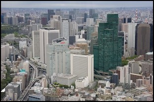
Compare with the two images we started from
Printing
That’s it, burn the JPEGs to a CDROM or put them on a USB stick and take them to a print shop. Make sure you specify that they’re to be printed with no borders to exactly 48” inches wide each (or whatever size you want).
Note: I’m not making the modified images available in full resolution, mainly because iweb doesn’t let me do that easily. But also because I think you should make your own that suits your needs. If you want an exact copy, the originals are on Flickr and you can just repeat these steps.
Mounting
The information about physical construction of the backdrops themselves, including photo mounting, is on the Backdrop Construction page in the Construction section.
I did things slightly differently for the River Crossing scene, see the Enlarging Photos page for a summary of that effort.
One thing worth highlighting: this kind of photo is an ink-jet print, when means the ink is applied using a volatile carrier fluid which evaporates to “cure” the ink. While most of this goes away quickly, a full cure takes time. I spread these photos out, image side up, on a table in the basement for a week or so before mounting them to ensure they’re well cured, and also to help smooth out the curve in the paper caused by it originally being on a roll in the printer. There’s a bit of an ammonia smell as the ink cures, so a table in a living area isn’t a good choice.
