


Kawate Station
13 May 2011 02:15 Filed in: Design
What’s in a name? I needed signs for my subway station, and I knew what form I wanted from some photos I found online (here and here) But these needed to identify the station, the subway line it was on, and the adjacent stations on the line. What line? And what station name? It’s not supposed to be any specific prototype. I’ve been calling this part of the layout the “riverside scene” and using “Riverside Station” informally up to now. And while I could have named it Riverside, that seemed wrong. Japanese signs use a lot of English, but rarely for place names.
A quick google translate of “Riverside” gave me four names including “川岸” (Kawagishi, meaning riverbank or riverside), but there is already a Kawagishi Station in Nagano. A little more digging with a dictionary turned up “川手” (Kawate, meaning “close to a river”), and while there’s a Kawate Castle in Gifu, there’s no train station of that name. Besides, I liked how it sounded. So with that decided, I could make up some signs for the station. Well, almost. I could make a sign to identify the station (the logo came from wikipedia), but that was only part of it.

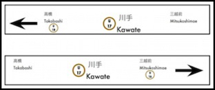
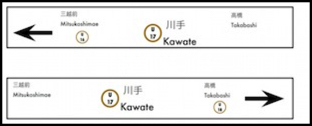
The next thing to decide was which line the station was on. Tōkyō Metro has 9 lines (see wikipedia for a list) distinguished by color-letter combinations (some of the colors are rather similar). I could have used the red-orange Fukutoshin line, since I already have one train for that line. Instead I decided to use a letter not already in use. “U”, for Sumida, since “S” is already in use for the Toei Shinjuku line they interconnect with. And I went with a color approximating that of the Fukutoshin line, for no reason other than I already had a train with trim in that color. Then I picked the name of an existing station just north of the center of Tokyo, Mitsukoshimae to be on one side, and a place-name across the river in Sumida ward that fell between several lines, Takabashi, to be on the other. A bit of work with google turned up Kanji forms of these names, which I could paste into my graphics software, and I had my main signs.
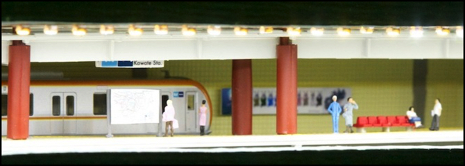
These were scaled to fit the signboards that came with the Kato platforms (abt. 3.5mm x 20mm), and printed at 300 dpi on glossy photo paper, then glued to the signboards with 3M Quick-Dry Glue (an acid-free white glue that sets in a matter of minutes). This is the same technique I used to make the advertising billboard on the back wall of the station.
The first set was hung under the lighting valance. Unfortunately the legs for the signs weren’t long enough to bring them down to a position where they are readily visible. I’ve only done one of the five platform sections so far, so I’ll make some changes for the later ones.
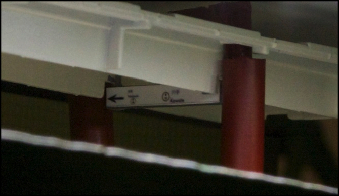
The rather invisible destination sign
I didn’t like the station map that came with the Kato platforms, so I used the same photo-print technique I’d used for the signs and billboards to make an appropriately sized copy of the Japanese edition of the Tōkyō Metro map from their web page. It’s a bit washed out in the photo below, but looks pretty good in person.
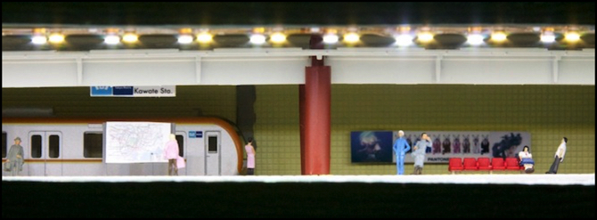
And the station name (above mapboard)
As you can see in the photo above, I also painted the overhead unit (which used to be gray) white, and the girders holding it up a dark red (they used to be yellow). And I made columns to surround the girders out of drinking straws, also painted dark red. There’s more about this on the “Phase 2k” construction page.
Then I painted the chairs on the platform a nice plasticy bright red color, and added some figures (mostly Prieser 1:160, but also some Tomytec 1:150 students). There are a bunch of Kato platform details I didn’t use, which didn’t seem to fit here (vending machines, for example), which I may end up using elsewhere.
There was another change made, which you can see in the photo above. The single row of “white” (6000°K) LED strip lights was supplemented by a second row of “warm white” (3100°K) LED strip lights, the two appearing white and yellow above. This gave the station a roughly 4500°K lighting, appropriate for a station lit by fluorescent lights (it’s slightly blue in person, as it should be, but not the bright blue it had been before).
And with that, I’m satisfied. I have a bit more work to do to finish it up, but it came out looking the way I’d wanted it to in general, and I’m pretty happy with the result. Once I finish it up, I can put the roof on semi-permanently (it’s not glued, but the Shinkansen tracks above it tend to limit access). And then I can turn my attention to finishing up the electrical work to get the commuter and subway lines (the DCC lines) back in operation.
Other website updates:
- Added photos to the Station photo album.
- Updated my Tomytec Bus page to report on some problems I’ve observed with grade climbing.
- Updated the Reservations page with a new reservation and the arrival (in Japan, not yet here) of one of the pending ones.
- Added some notes on color-correction to the LED Strip Lighting page.
- Added some material to the prototype Subway Stations page.
== Comments from old system:
Sunday, May 15, 2011 - 01:36 AM
quinntopia
This project is really looking great. I'm a bit jealous I haven't got space for a subway station (yes, I have thought about how I COULD add a line underneath everything to fit it in, but even I realize that's pushing it!).
What I really enjoyed from the post was your imagination and the way you worked to come up with a name for your station - in fact, you came up with a whole new line to serve your station! Brilliant!
I'm playing with names for my 'station area', 'yard area', and 'city area'....clearly these need some help....:-)
